Wednesday, November 27, 2013
Tuesday, November 26, 2013
TV Real Estate: The Homes We Virtually Grew Up In
I recently tripped down memory lane when I came across an episode of The Cosby Show. The familiar rooms of that unforgettable brownstone got me thinking of all the living rooms and kitchens we grew up watching. Here are the most memorable ones in my opinion...
The Brady's Kitchen
Wow, if that doesn't scream 1970s kitchen, I don't know what does! But it was perfectly in style with its decade. Kitchens were either done in harvest gold, avocado green or burnt orange. The Brady's chose to step out of the box and go with two of those memorable tones. And a center island complete with cabinets, a cook top and sink? Obviously ahead of its time, and a glimpse of what was in store for future kitchens.The Ricardo's Living Room
Even though this room changed 3 times - 2 New York apartments and 1 house in Connecticut - we can't forget the iconic living room that was seen in the earlier years of I Love Lucy. The modern straight lines of the furniture were completely on trend for the 1950s. The living room shown below is actually the 2nd apartment, differentiated only by the window above the piano.The Huxtable's Kitchen
Well, I had never seen a fireplace in a kitchen until I saw The Cosby Show. Actually, almost every room in that house had a fireplace in it! Anyway, this kitchen in particular will always be one of my favorites. It had a cozy feeling while offering plenty of room and being extremely accessible to four other spaces - the living room, the dining room, upstairs and the backyard.
Seinfeld's Open Floor Plan
Jerry's New York apartment had a modest open floor plan, featuring his bachelor pad style - bike hanging on the wall near the bathroom, Mets paraphernalia in the original episodes (that was changed to Yankees in the later years - but let's not go there) - a quintessential 90s look with enough room for 3 friends. This familiar apartment was where most every episode took place, which is why the image below is burned in the memories of all those who were Seinfeld fans.
Even though we've only scratched the surface with the rooms pictured above, one thing is evident: television set design is always on trend with the time period they're representing. So if you're in need of some inspiration before you design your 1960s vintage kitchen, go watch an episode of Mad Men.
Compass Real Estate, LLC
354 Pequot Avenue
Southport, CT 06890
(203) 255-7410
www.compass-reg.com
Thursday, November 21, 2013
Wallpaper City
When I asked a friend of mine (who's a real estate agent) why the house down the street from me was on the market for 3 years, he responded with a roll of his eyes and said "Ugh, wallpaper city."
It got me thinking about wallpaper and the love-hate relationship we've formed with it. Whether you like it or not, it's a design trend that refuses to completely remove itself from the world of home decor. While it waited patiently through a decade of bold paint colors, it has recently made a comeback, returning for the most part as an accent.
If you're hesitant to conform to this trend, take a look at the photos below. You might change your outlook...

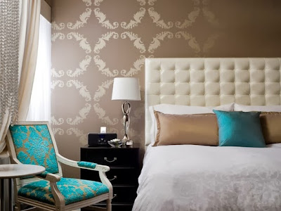
 Personally, not my taste, but for others who absolutely insist on wallpaper in their homes, it might be. A bold print can certainly bring a room to life, but it must be paired with furniture that doesn't scream or clash. Also staying in the color family and style of your decor helps to pull everything together.
It got me thinking about wallpaper and the love-hate relationship we've formed with it. Whether you like it or not, it's a design trend that refuses to completely remove itself from the world of home decor. While it waited patiently through a decade of bold paint colors, it has recently made a comeback, returning for the most part as an accent.
If you're hesitant to conform to this trend, take a look at the photos below. You might change your outlook...
A Little Goes A Long Way
Whether you're a wallpaper fan or not, you don't have to go overboard with the design. A 360 degree view of the same print can sometimes cause a headache. Accenting one wall (primarily the focal point of the room) can bring interest without being overwhelming. On the opposite walls, choose paint colors that pull tones from the wallpaper as seen in the pictures below.Choosing To Be Bold

 Personally, not my taste, but for others who absolutely insist on wallpaper in their homes, it might be. A bold print can certainly bring a room to life, but it must be paired with furniture that doesn't scream or clash. Also staying in the color family and style of your decor helps to pull everything together.
Subtle Hints
A tonal look can add a delicate touch to your room. It can bring an understated sense of texture if your desire is to showcase your furniture more than your walls. An elegant and safe choice if you're just dipping your toe into the wallpaper pool.
When You Can't Make Up Your Mind
Choosing two different prints in the same color family can really make a statement. And this option is for those who go back and forth between wallpaper samples, asking friends and family members for their opinions, letting swatches hang on the wall for months at a time, and so on. Why choose one when you can do both?
Ultimately you'll be the one staring at it, so take your time in making your decision. And remember, even the most beautiful wallpaper can be a disaster if it's not hung properly, which is why we've attached a link (c/o DIY Network) on how to hang the newest addition in your home...
And when you get sick of the wallpaper, we've also attached a link on how to remove it...
Compass Real Estate Group, LLC
354 Pequot Avenue
Southport, CT 06890
(203) 255-7410
www.compass-reg.com
Wednesday, November 20, 2013
Deck These Halls With Boughs of Holly
Got a lot of holiday decorations? Spread them out in this beautifully updated home in Easton, CT.
Actually, "updated" is an understatement. Completely gutted and remodeled is more like it. Moving into a brand new home has literal meaning here.
This gorgeous split-level home offers:
New Interior
New Exterior
2182 Square Feet
3 Bedrooms
2.5 Bathrooms
Living Room with Fireplace
Dining Room
Eat-in-Kitchen with New Appliances
New Countertops and Cabinets
Redesigned Bathrooms
Hardwood Floors Throughout
Lots of Closet Space
Finished Walk-Out Basement
Mud Room
2 Car Attached Garage
Located on a Large Wooded Lot
Don't wait on this one! To seek more information, contact:
Compass Real Estate Group, LLC
354 Pequot Avenue
Southport, CT 06890
(203) 255-7410
www.compass-reg.com
Thursday, November 14, 2013
100 Years of Kitchens
This Thanksgiving, let's be thankful for the evolution of kitchen designs. Here's a look back at the past 100 years.
The Early 1900s
I tapped into my mother's memory bank for this one. Although a child of the 50s, she grew up in a home that dated back to beginning of the 20th century. Her recollection of her childhood kitchen was spot on with the images I came across. Kitchens at the turn of the century typically consisted of a hardwood floor, an oven, sink, and a centrally located table to prepare food (much like the islands we're used to today). Built-in cabinets were hard to come by at this point, so free standing pantries and exposed shelving were used for the storage of food, dishes, pots and pants, etc. Also exposed were heat pipes, yet to be built on the inside of the walls, along with their cast iron radiator counterparts. Functional kitchens, but lacking in style.
Enter style. And enter the modernized kitchen that we're more used to seeing these days. The 1920s brought a more accessible and sanitary kitchen with easy to clean linoleum floors, built-in cabinets, and counterspace. Although it might have shrunk a bit in square footage, it still managed to accomodate all that the modern housewife required, while packing a punch of style with it.
The 1990s
And after all of that color, we needed a change, and boy did we. The 1990s, followed by the overindulgence of the 80s, brought no style or color at all. Although it did bring the return of hardwood floors, which unfortunately matched perfectly to the cabinets. Plain almond or white colored appliances went along with plain formica countertops. But it wouldn't be that way for long...
Granite. Stainless Steel. Islands. Lighting. Color. Texture. Today's kitchen is known as the central gathering place in the home. So it must look its best. Buyers have almost come to expect a kitchen with all of the features mentioned above.
A modern kitchen has almost everything from each time period. We'll take the idea of the island from the early 1900s, the idea of style from the 1920s, the idea of convenience from the 1950s, the idea of color from the 1970s, and the idea of texture from the 1990s. And after 100 years of progression, the kitchen doesn't seem to be slowing down any time soon.
Article by Kim Fromentin
for Compass Real Estate Group, LLC
The 1950s
Ugh, I love this time period. Who doesn't want their kitchen to replicate a diner atmosphere? Ok, maybe it's just me. Or maybe it's because the picture below features the the exact table, color and all, my grandparents had in their kitchen, and it conjours up many happy childhood memories. Functionality with bright pops of color was most common. Also notice how the laundry has made its way into the kitchen? Now the modern housewife can conveniently take care of all her chores in one area.
The 1970s
Ok, when I saw this picture I had a flashback, because this was my childhood kitchen. Complete with the harvest gold floor, refrigerator, stove, dishwasher and even telephone. Dark cabinets accompanied those earthy tones, which were most commonly offered in harvest gold, avocado green or burnt orange. Simplicity was the feature here. The basic straight lines of the cabinets, the simplistic cabinet pulls. I guess we needed that to compliment the paisley curtains and wallpaper!
And after all of that color, we needed a change, and boy did we. The 1990s, followed by the overindulgence of the 80s, brought no style or color at all. Although it did bring the return of hardwood floors, which unfortunately matched perfectly to the cabinets. Plain almond or white colored appliances went along with plain formica countertops. But it wouldn't be that way for long...
The New Millenium and Beyond...
Granite. Stainless Steel. Islands. Lighting. Color. Texture. Today's kitchen is known as the central gathering place in the home. So it must look its best. Buyers have almost come to expect a kitchen with all of the features mentioned above.
A modern kitchen has almost everything from each time period. We'll take the idea of the island from the early 1900s, the idea of style from the 1920s, the idea of convenience from the 1950s, the idea of color from the 1970s, and the idea of texture from the 1990s. And after 100 years of progression, the kitchen doesn't seem to be slowing down any time soon.
Article by Kim Fromentin
for Compass Real Estate Group, LLC
Wednesday, November 13, 2013
HOME FOR THE HOLIDAYS
Skip the lengthy process of buying and be in this spectacular rental by the holidays. Located in the Old Hill neighborhood of Westport, CT, this attractive colonial boasts an impressive floor plan with 4,300 square feet, 5 bedrooms, 4 1/2 baths, living room with fireplace, formal dining room, family room, large bonus room and master bedroom suite with a renovated bath.
On the exterior, this home features a screened porch, patio, private level yard with an in-ground pool and pool house. Located on a quiet cul-de-sac yet conveniently close to shopping, restaurants, the beach and public transportation makes this home quite desirable. $6100 month.
Compass Real Estate Group, LLC
354 Pequot Avenue
Fairfield, CT 06825
(203) 255-7410
www.compass-reg.com
Thursday, November 7, 2013
Thanksgiving Dress Code
Be inspired by our favorite table settings for the holiday...
You've just found out you're hosting Thanksgiving. This is one of the most enjoyable holidays because the main focus is on food, so the table setting should be secondary.
Here are a few inspired designs...
FANCY
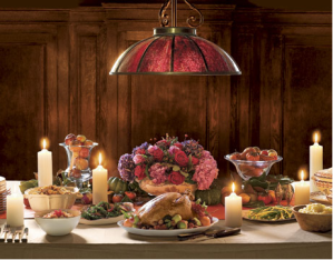
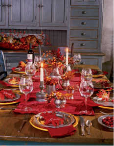
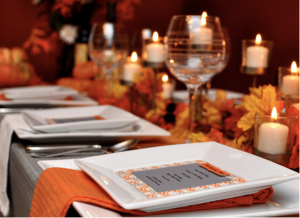
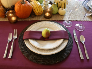
Elegant, chic, formal; however you may refer to it, this design is not just about the china or stemware, it's about lighting, textures and overall mood. This option not only features candles and floral arrangements, but your creative side as well. Preparing individual menus, place cards, color schemes and festive accessories go hand in hand with the fancy Thanksgiving table. These table settings display an attractive sophistication and can add a serious amount of style to your feast.
SIMPLE
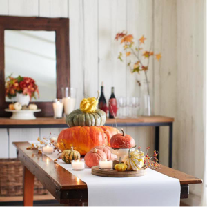
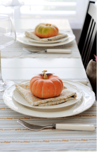
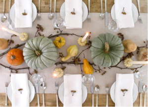
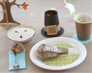
Cozy, casual, informal; this style is what most of us are used to. But don't let "simple" be confused with "uninterested". The simplest tables can also be the most chic. And remember, these beautiful tables will soon be full of color and life when the food is added.
KID-FRIENDLY
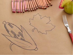
If you have kids, then you already know keeping them seated at the table for a long period of time can be a challenge. Rather than sitting on pins and needles, hoping they don't break your great grandmother's fine china; exchange the elegant white tablecloth and expensive flatware for butcher paper and crayons and let them go to town. When they're happy, you're happy. And you can enjoy your meal while they're entertaining themselves.
The decision to go elegant, festive, casual or kid-friendly is up to you. Your table should reflect your own personal style and traditions. Putting too much emphasis on being perfect is bound to raise the stress levels. So take a deep breath, relax and enjoy the holiday!
Subscribe to:
Comments (Atom)
.bmp)

.bmp)


.bmp)



.bmp)
.bmp)


.bmp)

.JPG)


